


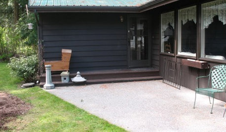
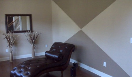
Page design questions
heatherbon
15 years ago
Related Stories
WORKING WITH PROS12 Questions Your Interior Designer Should Ask You
The best decorators aren’t dictators — and they’re not mind readers either. To understand your tastes, they need this essential info
Full Story
MOST POPULAR8 Questions to Ask Yourself Before Meeting With Your Designer
Thinking in advance about how you use your space will get your first design consultation off to its best start
Full Story
5 Questions for Houzz Design Stars
Post Ideas for Updating an Exterior, Balancing an Off-Center Window and More
Full Story
REMODELING GUIDES9 Hard Questions to Ask When Shopping for Stone
Learn all about stone sizes, cracks, color issues and more so problems don't chip away at your design happiness later
Full Story
COFFEE WITH AN ARCHITECTA Quiz for Architects in Question
Should you trade in your T-square for a barista tray? Answer a few simple questions to find out
Full Story
KITCHEN DESIGNPaging All Foodies: Your Banquette Is Ready
Please follow us to these 7 gorgeous dining nooks designed for everything from haute cuisine to s'mores
Full Story
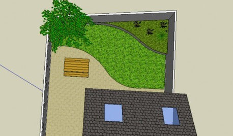
Chemocurl zn5b/6a Indiana
token28001
Related Professionals
Walnut Landscape Architects & Landscape Designers · Chesapeake Ranch Estates Landscape Contractors · Fishers Landscape Contractors · McLean Landscape Contractors · New Cassel Landscape Contractors · Paramount Landscape Contractors · Peachtree City Landscape Contractors · Pompton Lakes Landscape Contractors · Charlotte Roofing & Gutters · Gibsonton Roofing & Gutters · Ponte Vedra Beach Roofing & Gutters · Cypress Lake Carpenters · Randallstown Decks, Patios & Outdoor Enclosures · Redlands Decks, Patios & Outdoor Enclosures · Shirley Decks, Patios & Outdoor EnclosuresChemocurl zn5b/6a Indiana
alwaysagarden
rosepedal
heatherbonOriginal Author
littleonefb
dorisl
luvsgrtdanes
heatherbonOriginal Author
luvsgrtdanes
dorisl
alwaysagarden
terrene
thepodpiper