


anyone help with color wheel
Poorbutroserich Susan Nashville
11 years ago

Featured Answer
Comments (18)

kittymoonbeam
11 years agolast modified: 9 years agoRelated Professionals
Folsom Landscape Architects & Landscape Designers · Hyattsville Landscape Architects & Landscape Designers · Lowell Landscape Architects & Landscape Designers · Canton Landscape Contractors · Brooklyn Park Landscape Contractors · Damascus Landscape Contractors · Davidson Landscape Contractors · Elkridge Landscape Contractors · Kahului Landscape Contractors · La Vista Landscape Contractors · Little Ferry Landscape Contractors · Raleigh Landscape Contractors · Wanaque Landscape Contractors · Waterford Landscape Contractors · Woodbury Landscape Contractorsdonaldvancouver
11 years agolast modified: 9 years agokittymoonbeam
11 years agolast modified: 9 years agosaldut
11 years agolast modified: 9 years agosubk3
11 years agolast modified: 9 years agokittymoonbeam
11 years agolast modified: 9 years ago
Poorbutroserich Susan Nashville
11 years agolast modified: 9 years ago
harborrose_pnw
11 years agolast modified: 9 years agoharborrose_pnw
11 years agolast modified: 9 years agoharborrose_pnw
11 years agolast modified: 9 years agojeannie2009
11 years agolast modified: 9 years agoharborrose_pnw
11 years agolast modified: 9 years agokittymoonbeam
11 years agolast modified: 9 years agoPoorbutroserich Susan Nashville
11 years agolast modified: 9 years agoharborrose_pnw
11 years agolast modified: 9 years agoiamabeingoflight
11 years agolast modified: 9 years agojulia034
11 years agolast modified: 9 years ago

Related Stories
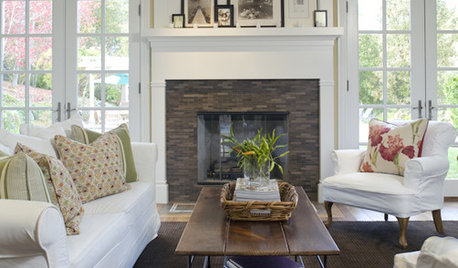
DECORATING GUIDESThe Cure for Houzz Envy: Family Room Touches Anyone Can Do
Easy and cheap fixes that will help your space look more polished and be more comfortable
Full Story
DECORATING GUIDES7 Bedroom Styling Tricks Anyone Can Do
Short on time or money? You can spruce up your bedroom quickly and easily with these tips
Full Story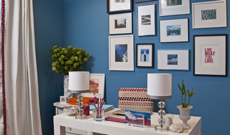
HOME OFFICESThe Cure for Houzz Envy: Home Office Touches Anyone Can Do
Borrow these modest design moves to make your workspace more inviting, organized and personal
Full Story
COLORChoosing Hues: Roll With the Color Wheel
See how an age-old tool can help you find the right paint
Full Story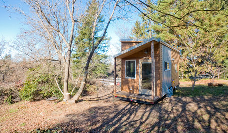
SMALL HOMESHouzz Tour: Rolling With Simplicity in a Tiny House on Wheels
Just 240 square feet, this California home encourages efficient living — but there’s still room for yoga
Full Story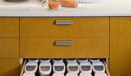
KITCHEN DESIGN6 Clever Kitchen Storage Ideas Anyone Can Use
No pantry, small kitchen, cabinet shortage ... whatever your storage or organizing dilemma, one of these ideas can help
Full Story
ENTRYWAYSHelp! What Color Should I Paint My Front Door?
We come to the rescue of three Houzzers, offering color palette options for the front door, trim and siding
Full Story
COLORPick-a-Paint Help: How to Create a Whole-House Color Palette
Don't be daunted. With these strategies, building a cohesive palette for your entire home is less difficult than it seems
Full Story
UNIVERSAL DESIGNMy Houzz: Universal Design Helps an 8-Year-Old Feel at Home
An innovative sensory room, wide doors and hallways, and other thoughtful design moves make this Canadian home work for the whole family
Full Story
KITCHEN DESIGNKey Measurements to Help You Design Your Kitchen
Get the ideal kitchen setup by understanding spatial relationships, building dimensions and work zones
Full Story
Poorbutroserich Susan NashvilleOriginal Author